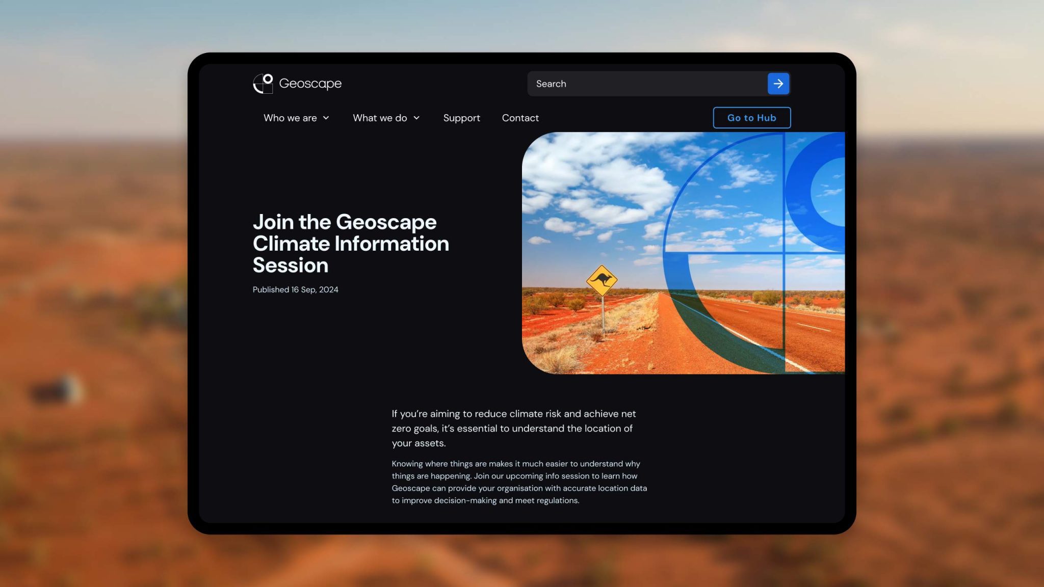
Data Pinata Battle
Meet Paulie. Created in 2022 by NZ telco 2degrees, he’s a digital character Kiwis could smash free mobile data out of, every day over summer. But after four summers of dishing out the data, the experience wasn’t hitting the same. Free data wasn’t enough and it wasn’t getting 2degrees any new customers.
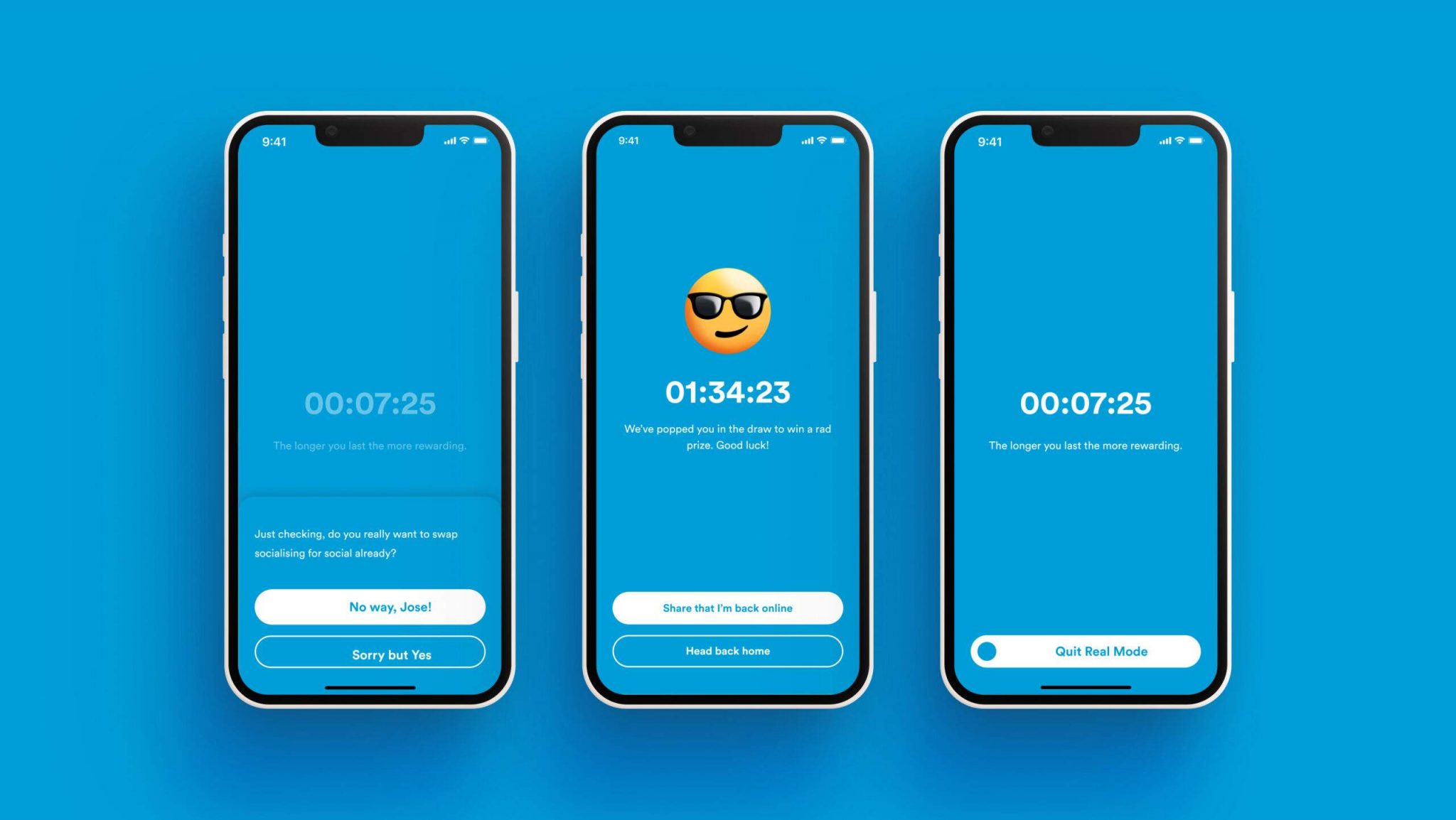
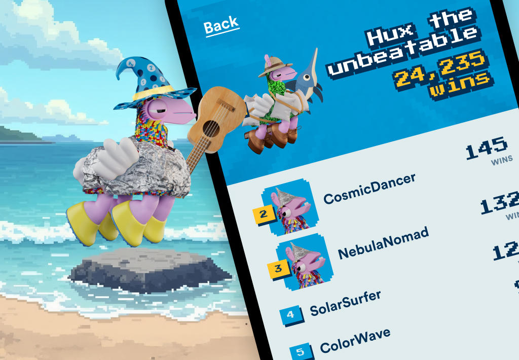
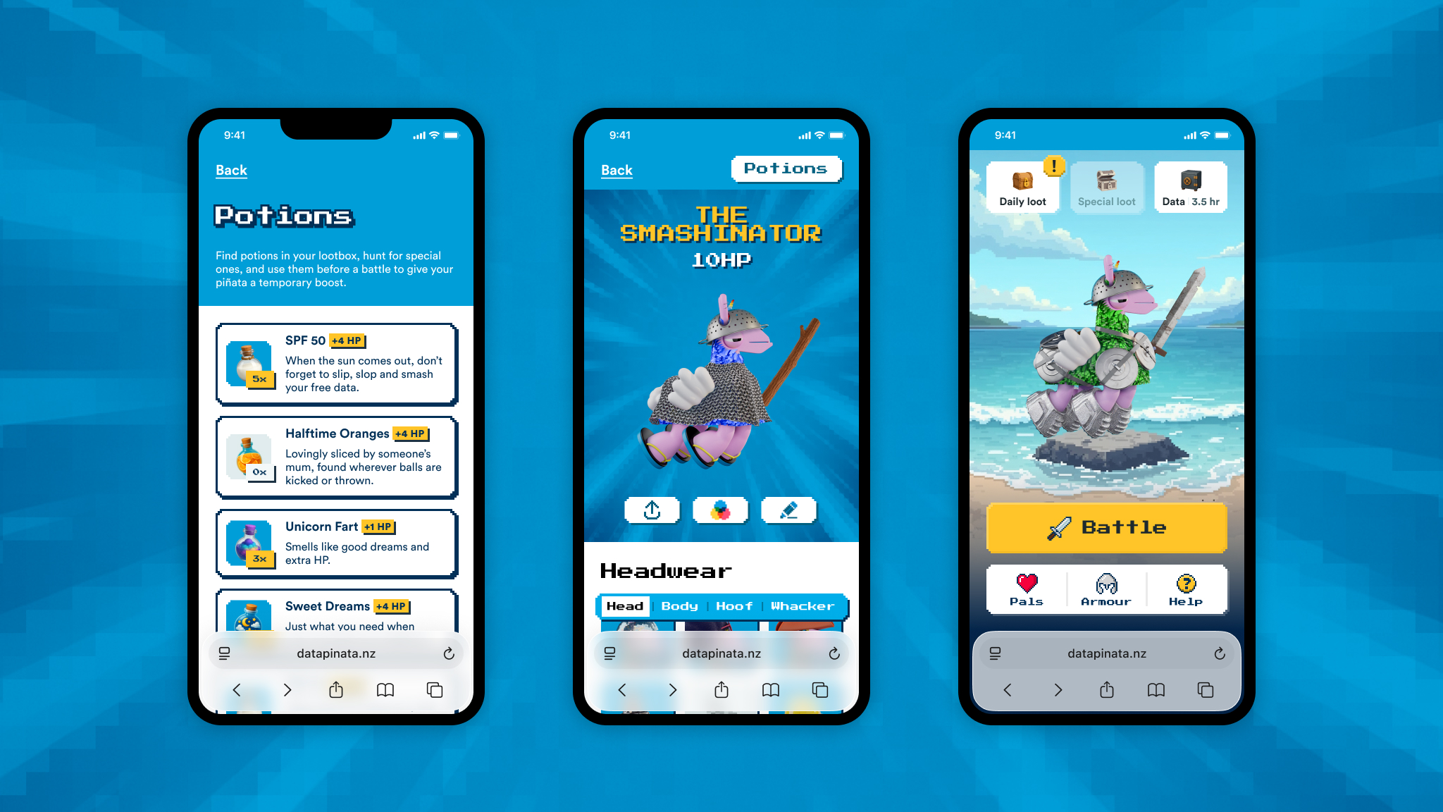
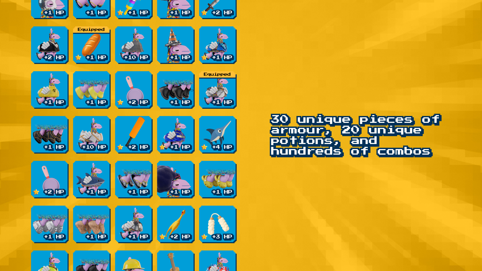
Enter Data Pinata Battle, a web game where people battle it out online for free mobile data every single day over summer. People could create their own piñata, pick it’s armour, and invite their mates to battle it out with. The better the armour, the better chance of winning your battles.
For those on another network the game would store up all your stashed data, which they could claim at anytime by switching to 2degrees.
The big numbers
2.84M+
Battles fought
Competitive behaviour that keeps players returning and moving deeper into the experience.
1,260,488
Daily Loot Opens
A sustained habit loop that drives repeat engagement and primes players for conversion messaging.
224K+
Unique players
Repeat players, non-2d customers, and players building their own micro-networks.

Other projects
- Data Pinata BattleSeason 4 of Data Pinata where people battle it out online for free mobile data every single day over summer.
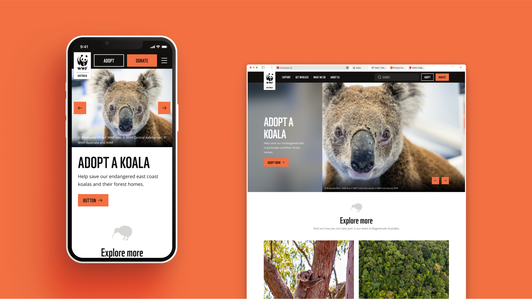
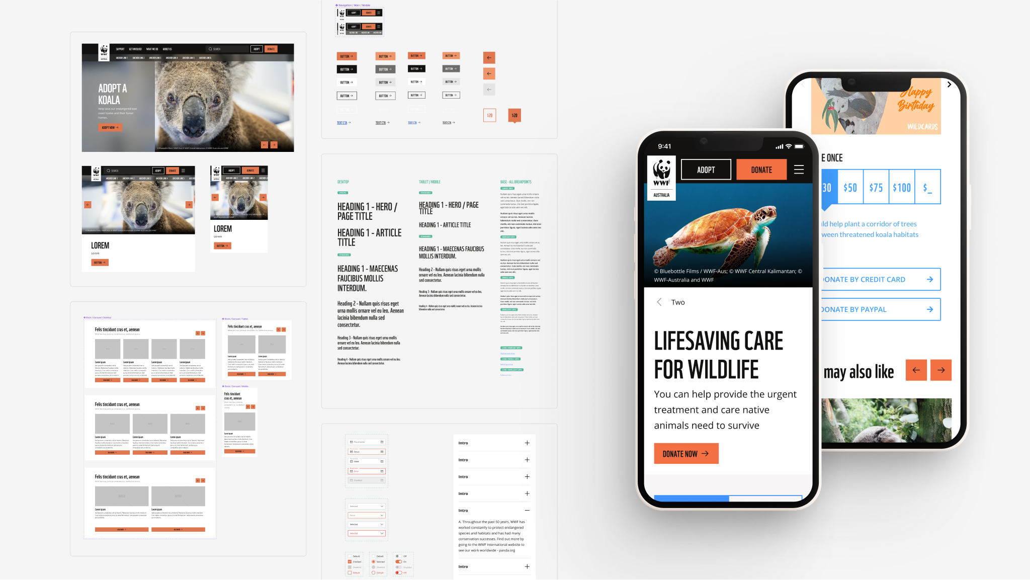
- Empowering Conservation StorytellersEquiping WWF Australia’s content creators with intuitive tools.
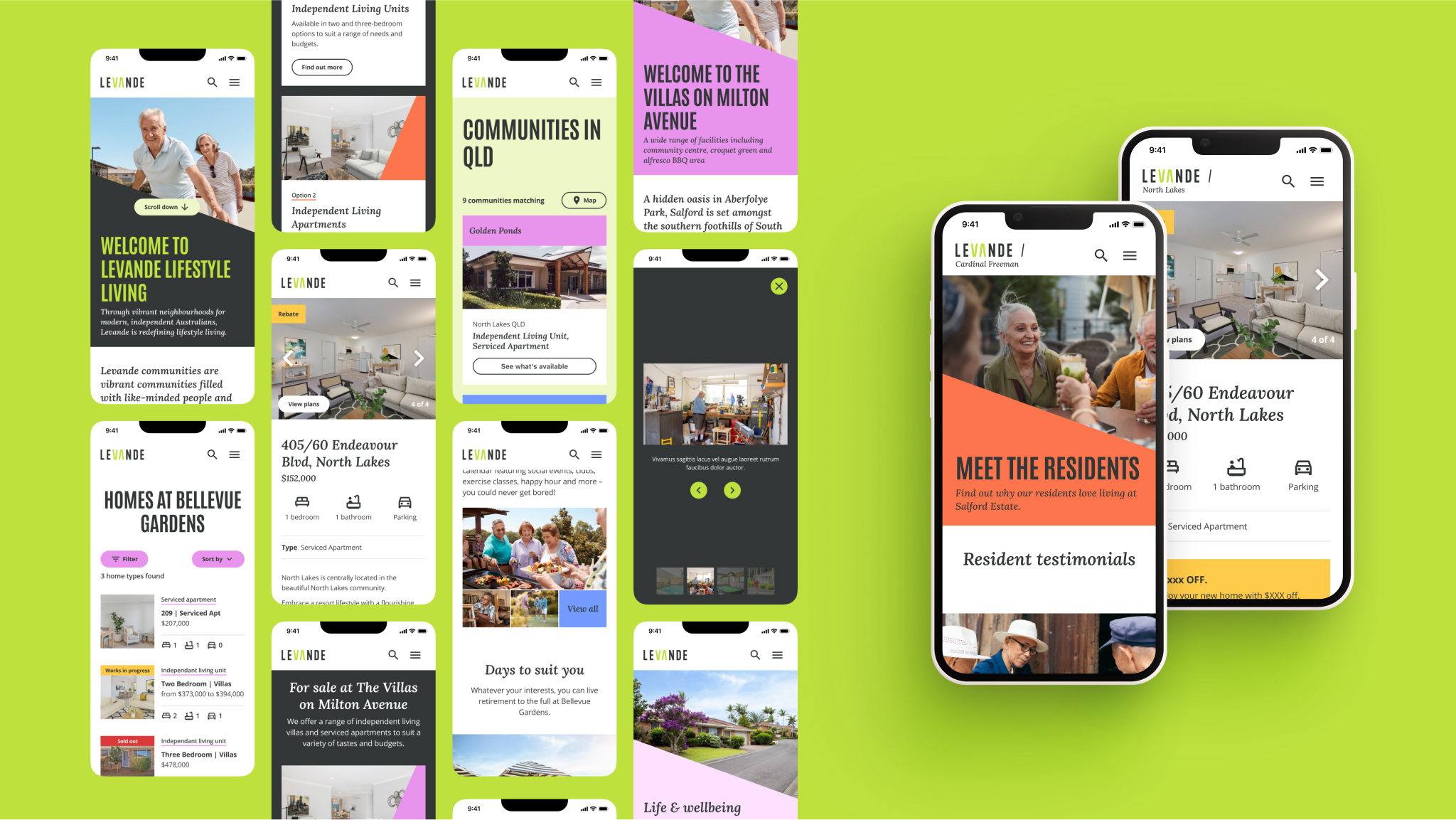
- Keeping the Organic EdgeEnsuring that Levande goes through a modern replaftorm of the digital experience platform while retaining all their years of organic traffic