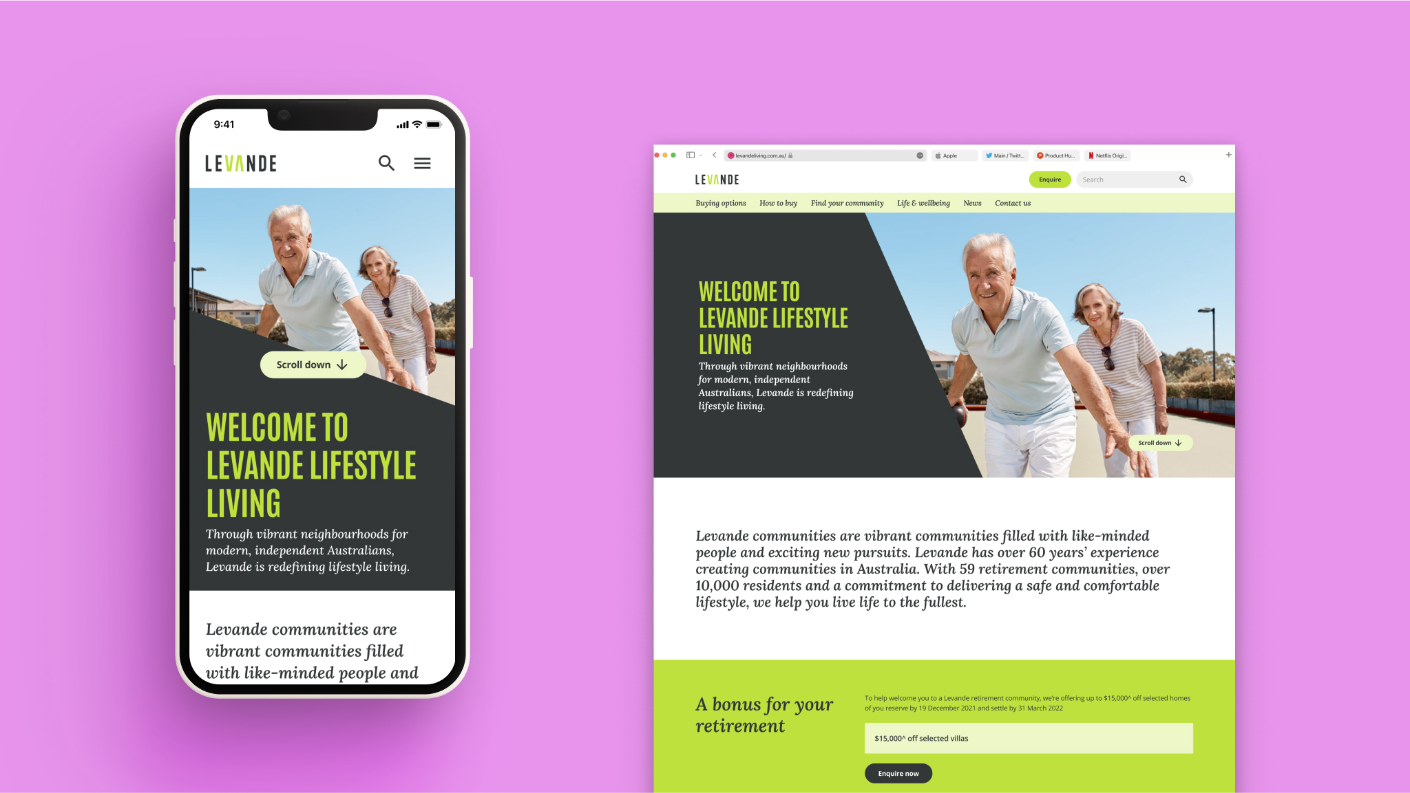
Keeping the Organic Edge
In 80 days myself and DAN re-designed and rebuilt one of Australia’s largest property conglomerates’ Retirement Living Business Unit into a standalone Retirement Living business called Levande.
The post build saw an increase of 33%, to 100% in their Lighthouse scors across SEO, Performance and Best Practice.
The Site is now the main source of customer attraction, acquisition, conversion and retention with a capability to deliver on a 5 year multi-horizon resident experience transformation. It is integrated into Dynamics 365, Salesforce, Workato and Meta
The outcomes
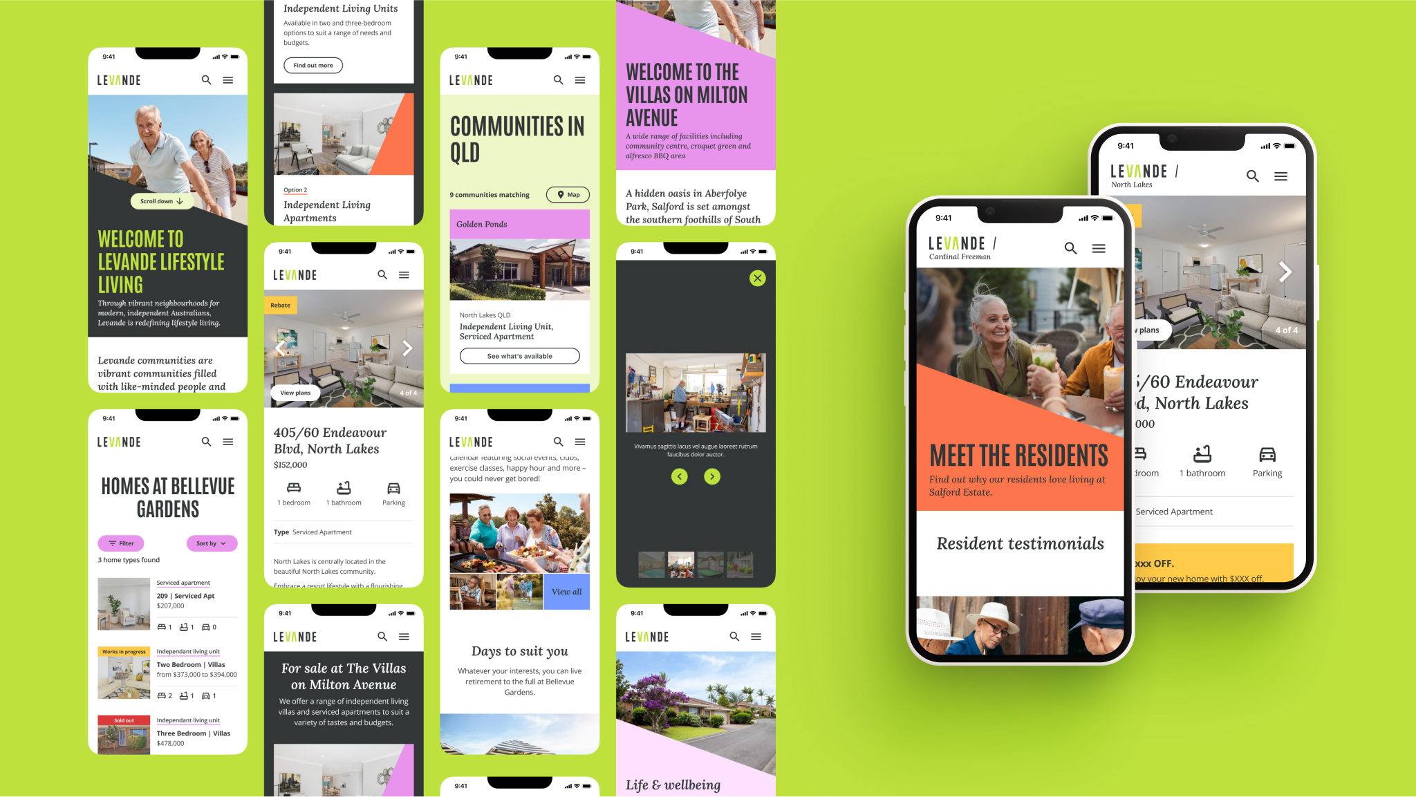
80
Days to redesign, rebuild and re-platform
5000+
Pages of content and experiences
55+
Communities that were personalised and individually themed
Other projects
- Data Pinata BattleSeason 4 of Data Pinata where people battle it out online for free mobile data every single day over summer.
- Empowering Conservation StorytellersEquiping WWF Australia’s content creators with intuitive tools.
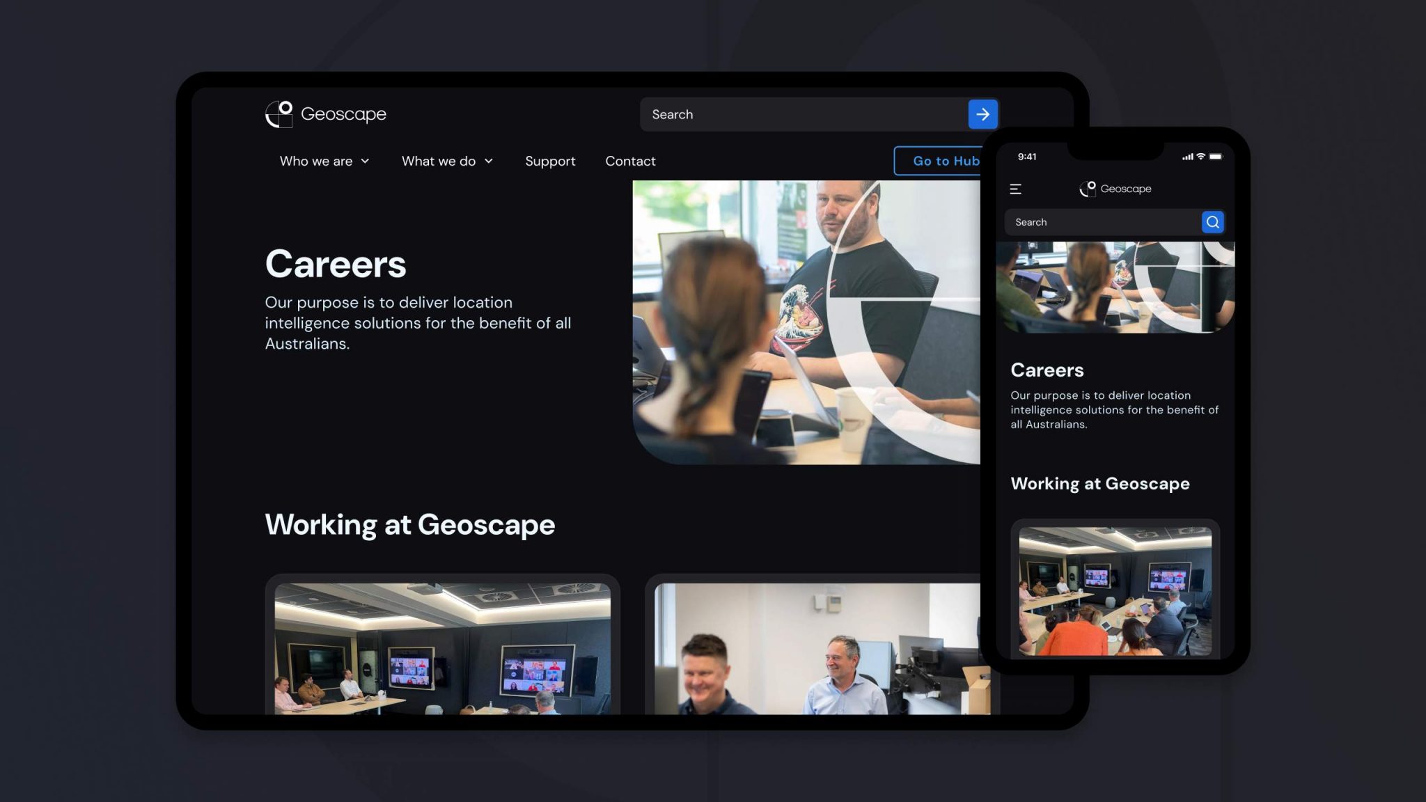
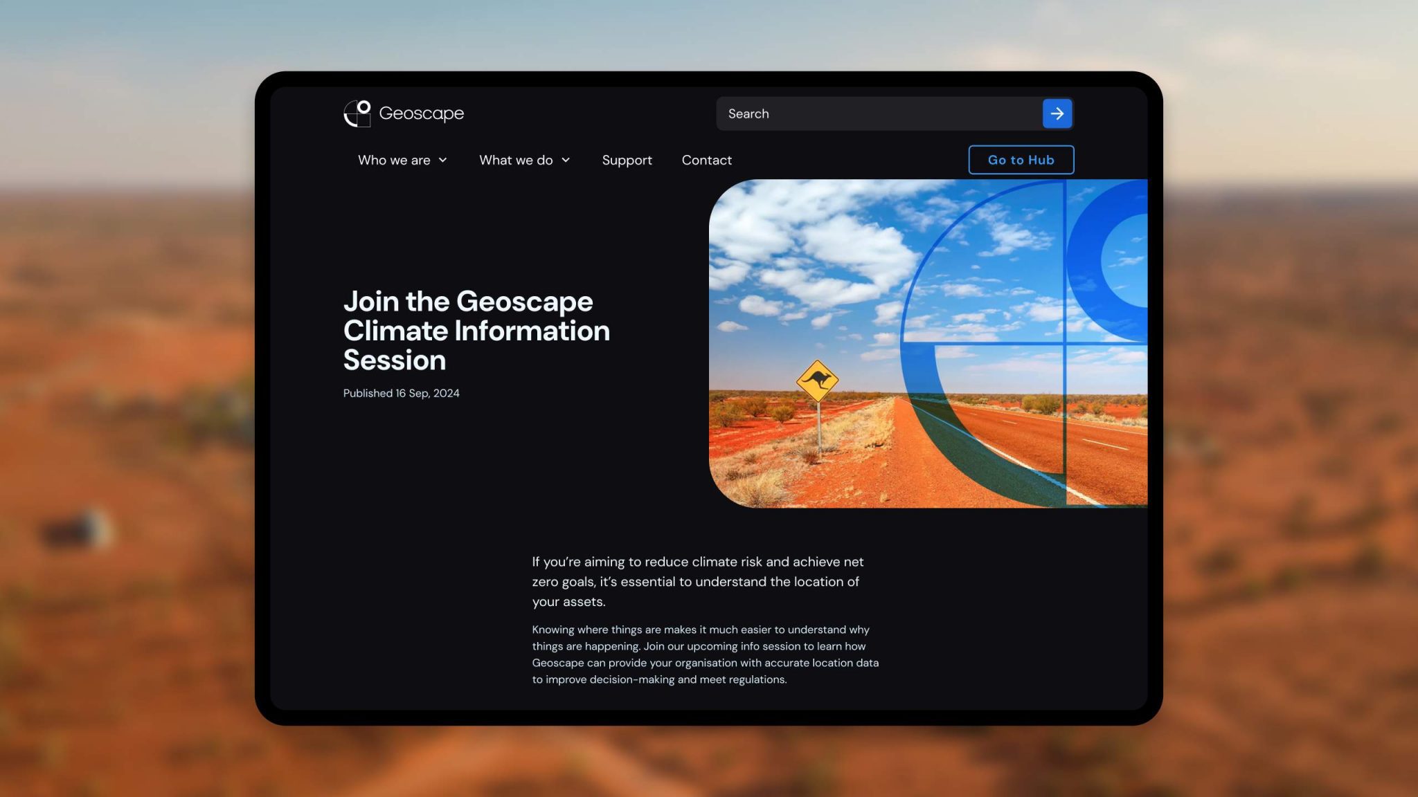
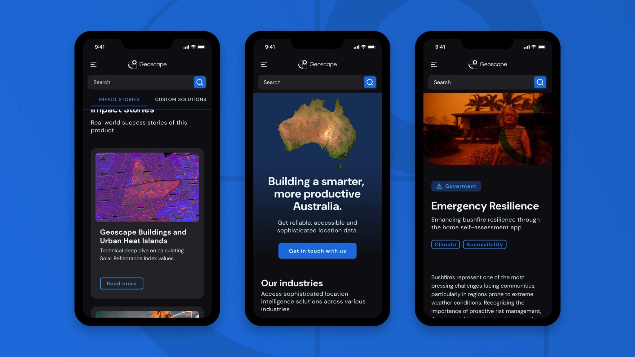
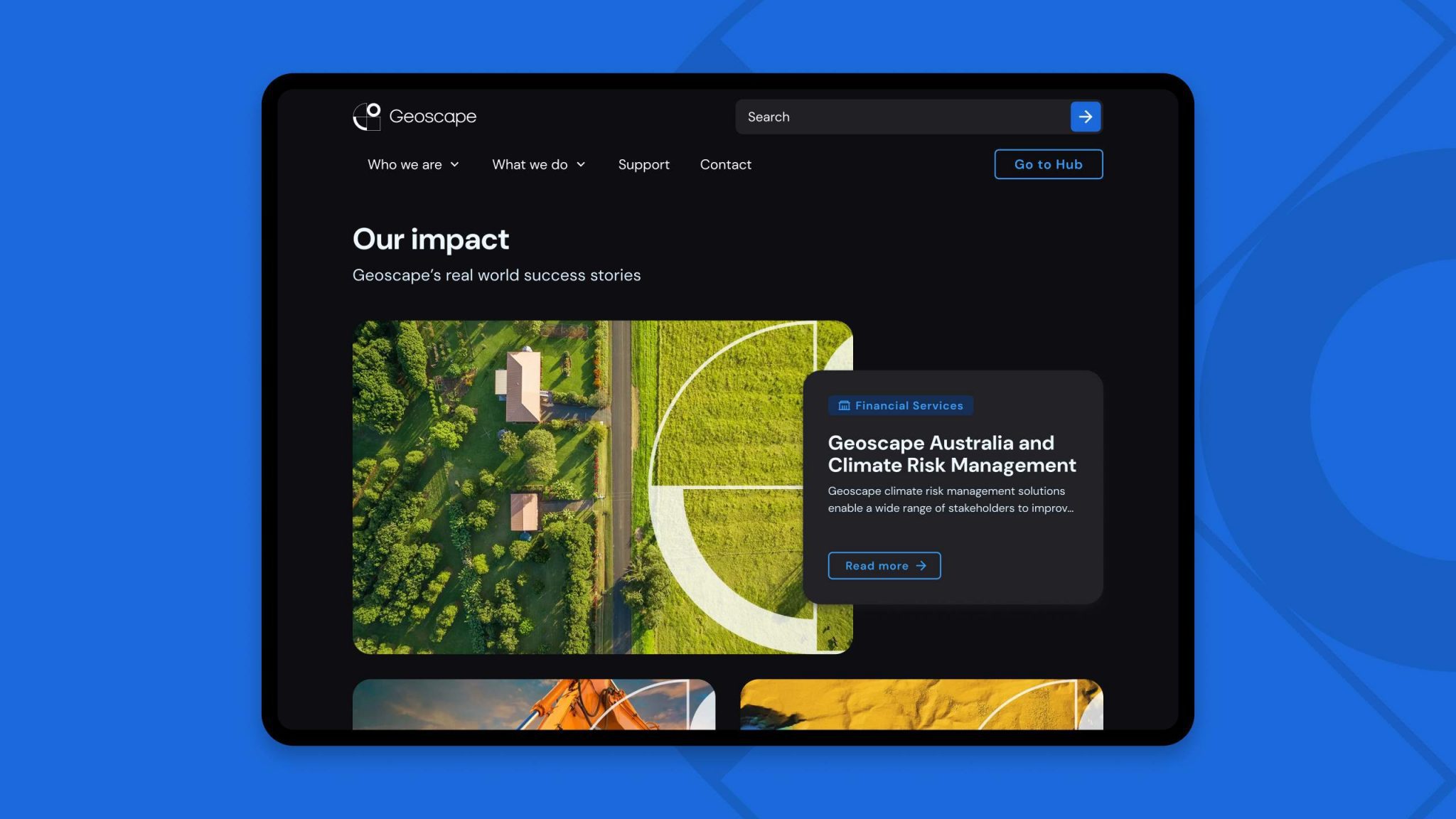
- Keeping the Organic EdgeEnsuring that Levande goes through a modern replaftorm of the digital experience platform while retaining all their years of organic traffic