Digital Workplace Research

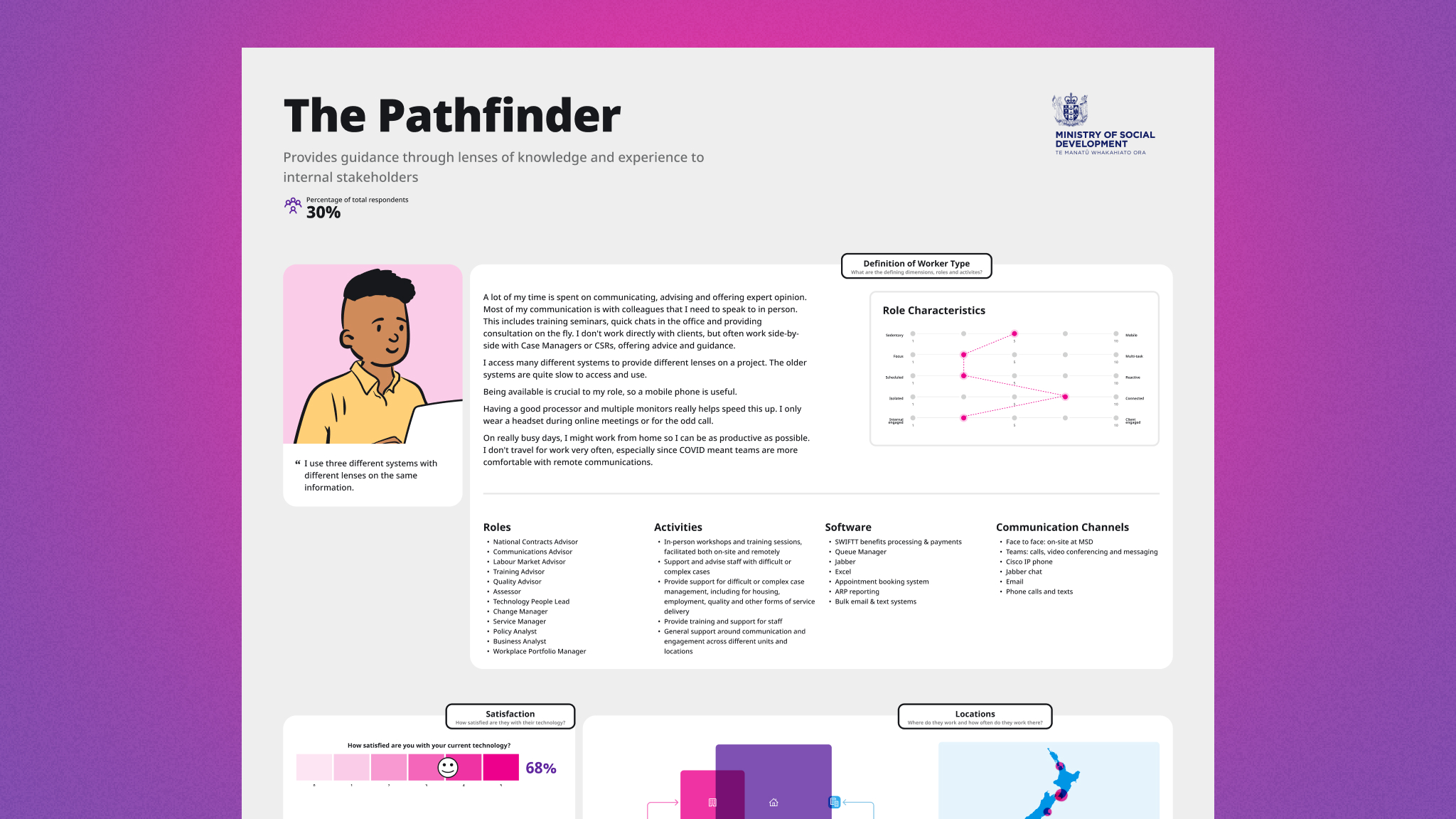
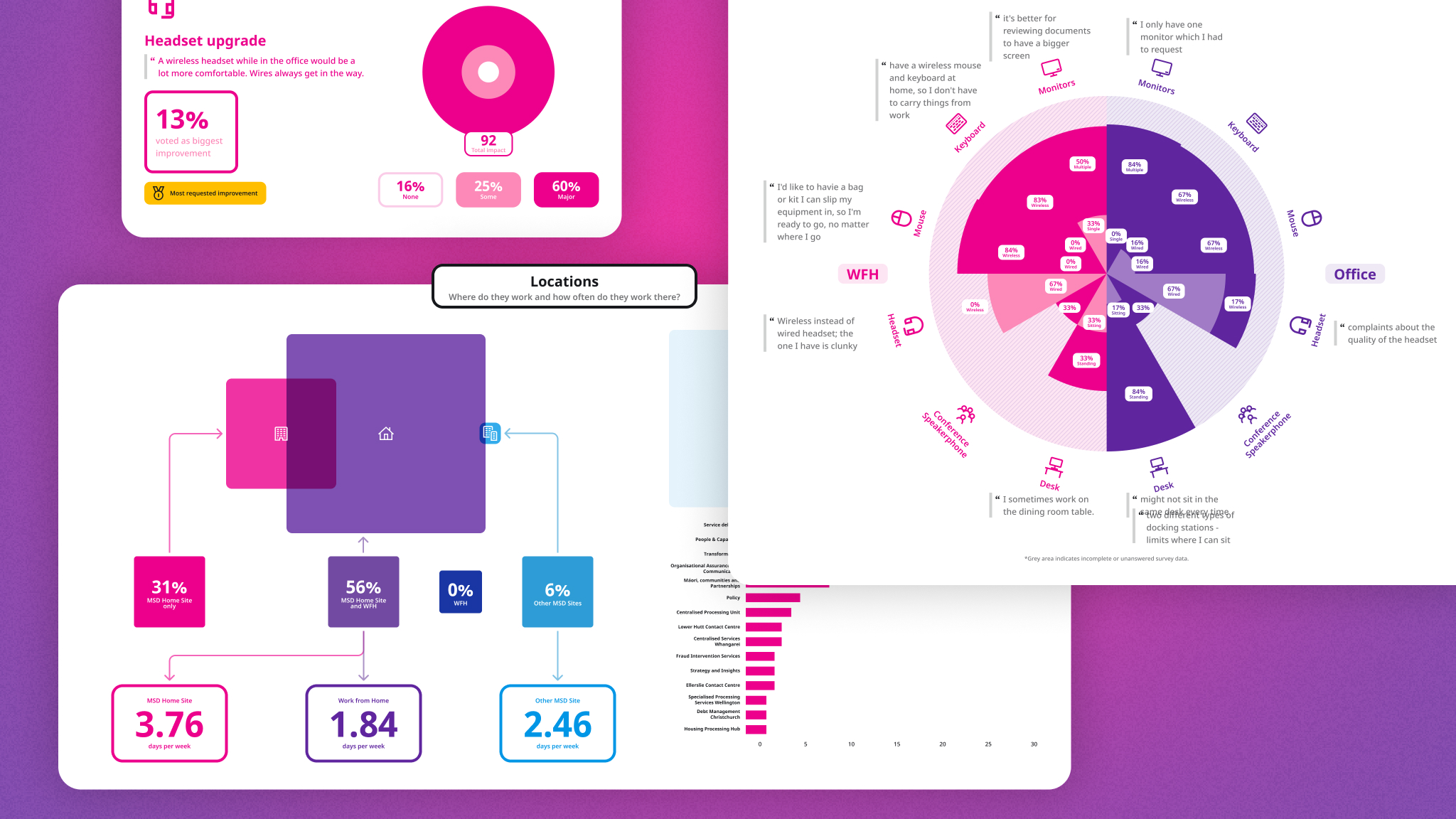
To ensure data-driven design artifacts, we prioritised a quantitative approach, supported by qualitative research. Interviews with MSD staff, coupled with dimension mapping and thematic analysis, shaped proto-archetypes. Surveying nearly 1,000 staff generated segmented Worker Types with distinct technology requirements.

The research is being used as part of the Digital Transformation Programme to inform device and technology solutions supplied to the 11,000 staff across Aotearoa. The Worker Type artefacts themselves are on display at MSD Home Office in Wellington, inviting engagement and feedback from the wider organisation.

|   

Discover Card Smarts

With fierce competition and an abundance of financial content available, Discover wanted to turn their credit card blog into a best in class knowledge hub. It needed to reflect their visual identity and drive on page engagement.

Digital Arts designed and built a fresh mobile first content hub with a reworked and tested taxonomy that helps consumers find what they need and ultimately guides them to convert. We focused on getting the foundations right – making it accessible, enhancing the consumer experience and enabling Discover to publish efficiently.

Countdown Delivery Saver

The first round of testing for Delivery Saver involved interviews with staff and real customers. During this phase, the project team spoke to customers who had used the delivery service in the past and asked them questions about their experience. They also spoke to staff members who were responsible for delivering groceries to customers and managing the delivery process.

Through these interviews, the project team was able to identify some common pain points that customers and staff experienced. For instance, customers mentioned that they often found delivery fees to be expensive and inconvenient, and that they would be willing to pay a subscription fee for free delivery. On the other hand, staff members mentioned that they sometimes faced challenges in managing delivery routes and schedules, and that the delivery process could be streamlined.

The project team used this feedback to make several changes to the Delivery Saver service. They decided to offer customers the option to pay for delivery on a per-order basis rather than requiring a subscription fee, which addressed the concerns of customers who preferred to shop in-store. They also worked on improving the delivery process by hiring additional staff and improving delivery scheduling.

The second round of user testing involved in-person interviews with a larger group of customers. During this phase, the project team presented customers with a prototype of the Delivery Saver service and asked for feedback. The team observed how customers interacted with the service and asked follow-up questions to understand any issues or concerns.

Overall, the Delivery Saver project was successful in providing customers with a convenient and affordable delivery option. By using a combination of interviews with staff and real customers, the project team was able to identify key pain points and make necessary changes to the service to address them. The team’s willingness to listen to feedback and make adjustments ensured that the service met the needs of its users and was ultimately successful.


The results

Customer sign up in first week
Average weekly basket size increased by
Percentage of customers who continued subscription

Latest projects

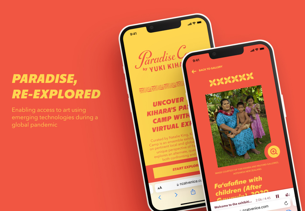
Paradise, re-explored

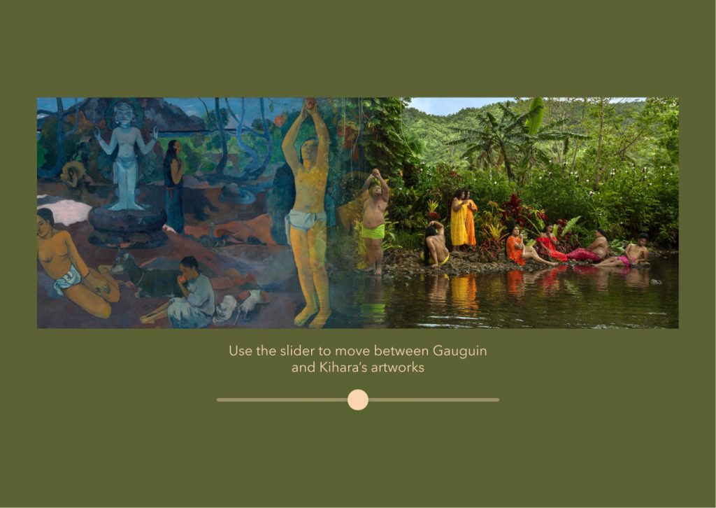
The work of Sāmoan-Japanese artist Yuki Kihara reclaims the work of Paul Gauguin’s from a Fa’afafine (Sāmoa’s ʻthird gender’) perspective. This year, Kihara became the second New Zealander of Pacific descent to be invited to global Biennales.

Travel restrictions due to the pandemic meant that attendees from Aotearoa and across the globe would not have access to the international exhibition.

Therefore, our challenge question for this project was: How might we turn travel restrictions into an opportunity for making the arts more accessible?

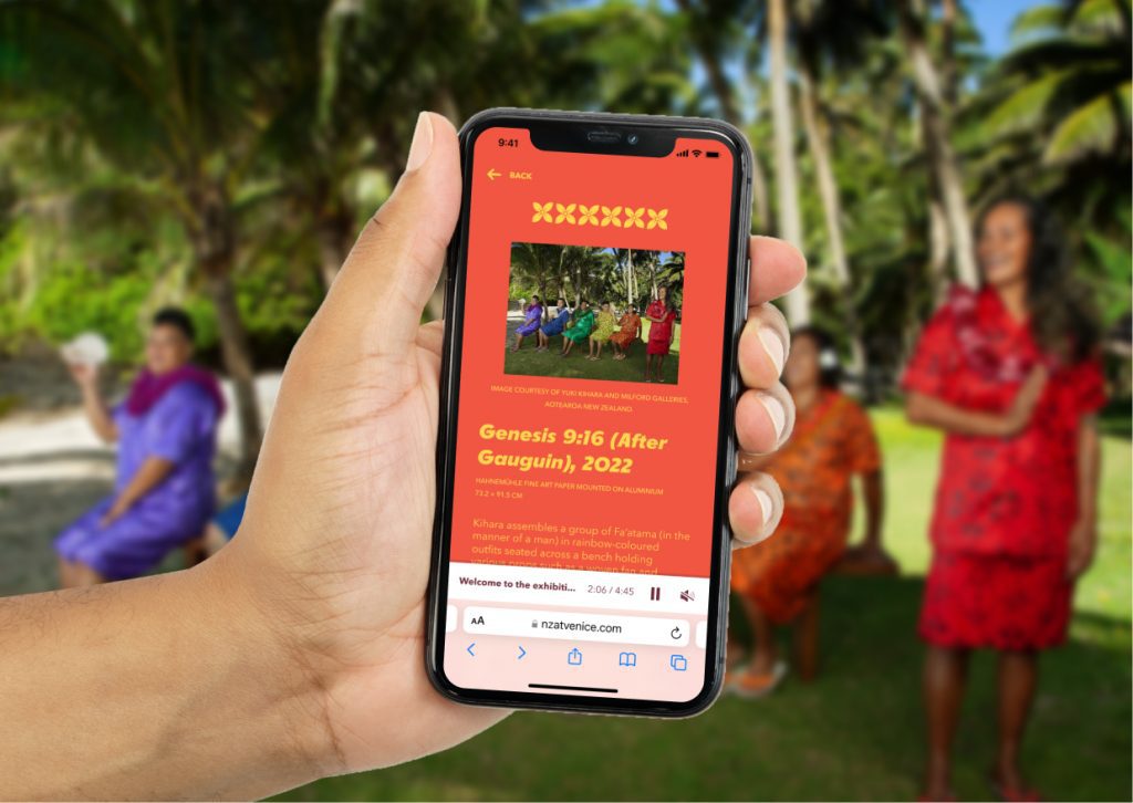
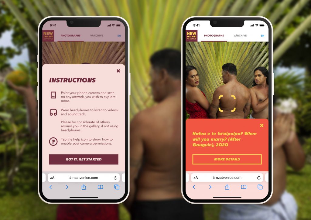
Our answer was to collaborate with the Arts Council of New Zealand toi Aotearoa and Yuki Kihara to create an AI-supported virtual experience that opened access to the exhibition from anywhere.

Examples of artwork information screen, accessed by scanning the artwork in the art gallery with the phone camera

The results

IRL visitors to the exhibition during the first 4 days
Virtual visitors to the exhibition
Page views for the web experience
Countries virtually attended the exhibition

Latest projects

Korero Pitopito

I was always doodling when I was a kid, then took design and fine art courses in college. I always had an interest in a wide mix of creative outlets such as print, painting, illustration, motion and music.

I studied Graphic Design at university, this was before UX and UI were taught in design courses. My first role was as a Web Designer at a start-up so I had to design and build everything. I then moved to Burberry where they were starting up a UX & UI team and I learned everything I could!

Usually, it will be a mix of discussions with other designers, stakeholders, and developers to ensure that what I’m creating is on the right track. Then I’ll either be setting up user flows in Miro, Designs in Sketch/Figma, or prototyping with Axure. It all depends on which point the project is at. Ideally a few cups of tea and some chocolate biscuits help too!

It’s the people. Design is a group activity and each person here can give you a new perspective on a piece of work. There’s a huge amount of knowledge here and I’m very fortunate to be part of it.

That constant push to improve the experience for customers and clients — be it through small insights gleaned through testing or utilising new technologies. Also by pushing and breaking rules (not all of them at the same time obvs) you can get into some interesting place.

Go weird and really out there and pair it back as needed. Don’t play it safe. Embrace the weird or seemingly wild ideas and some spark of inspiration will come out.

Seeing as millions of people have been distancing themselves due to COVID-19, digital experiences have become even more important. Stores are utilising VR to sell clothing, apps such as Miro and Figma have allowed us to work and design together, and companies such as Apple and Prime are enabling people to watch videos together even though they’re apart.

Using a teams call and a Miro board meant me and another designer could knock out an entire flow and wireframes in a couple of hours even though we were in different place. Something that takes a lot longer with a chain of emails!

You will make mistakes. Sometimes huge ones, sometimes little ones. However, as long as you learn from these you will be okay and grow as a designer. Also don’t be afraid to ask your peers / stakeholders / leaders if something doesn’t make sense to you, clarity on your goals is what makes a piece of design work even better.

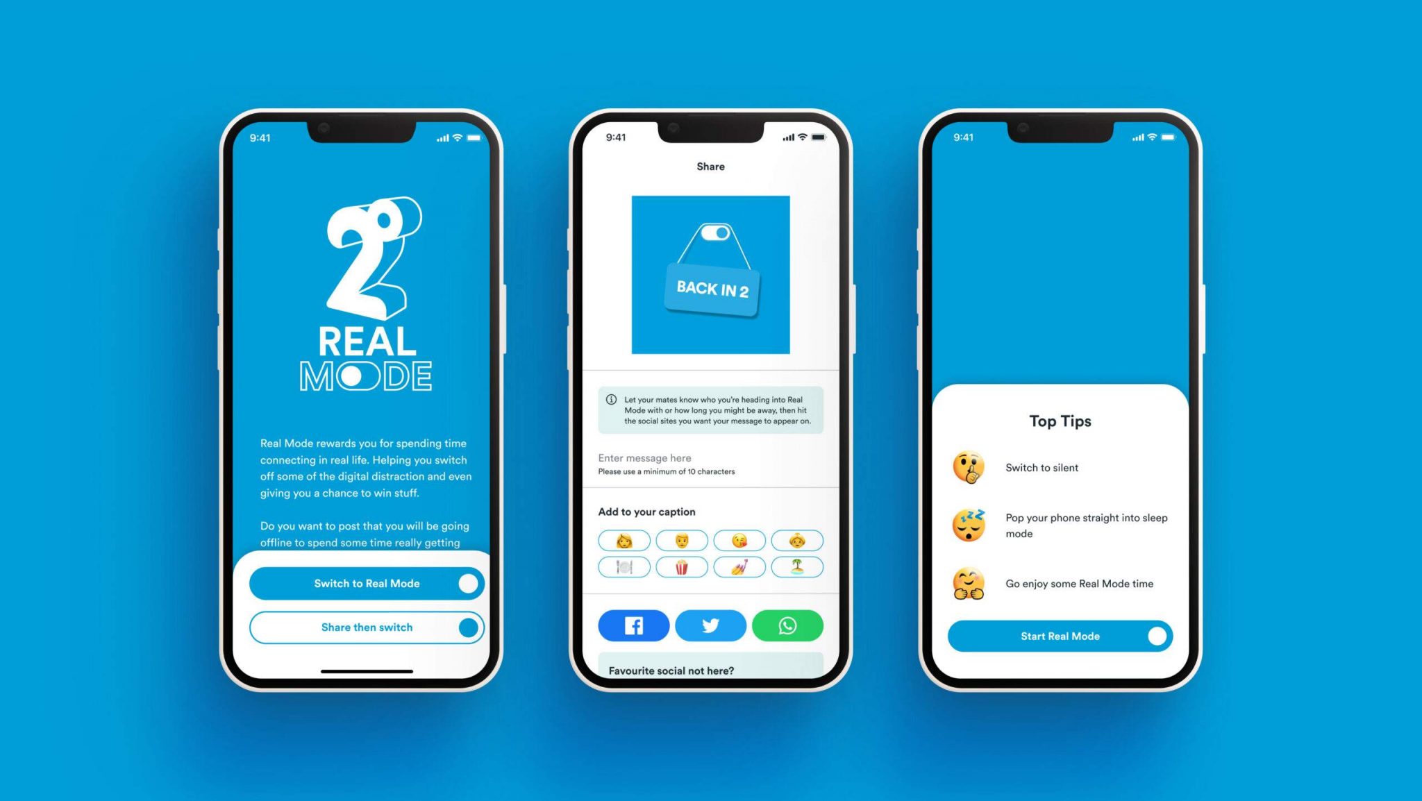
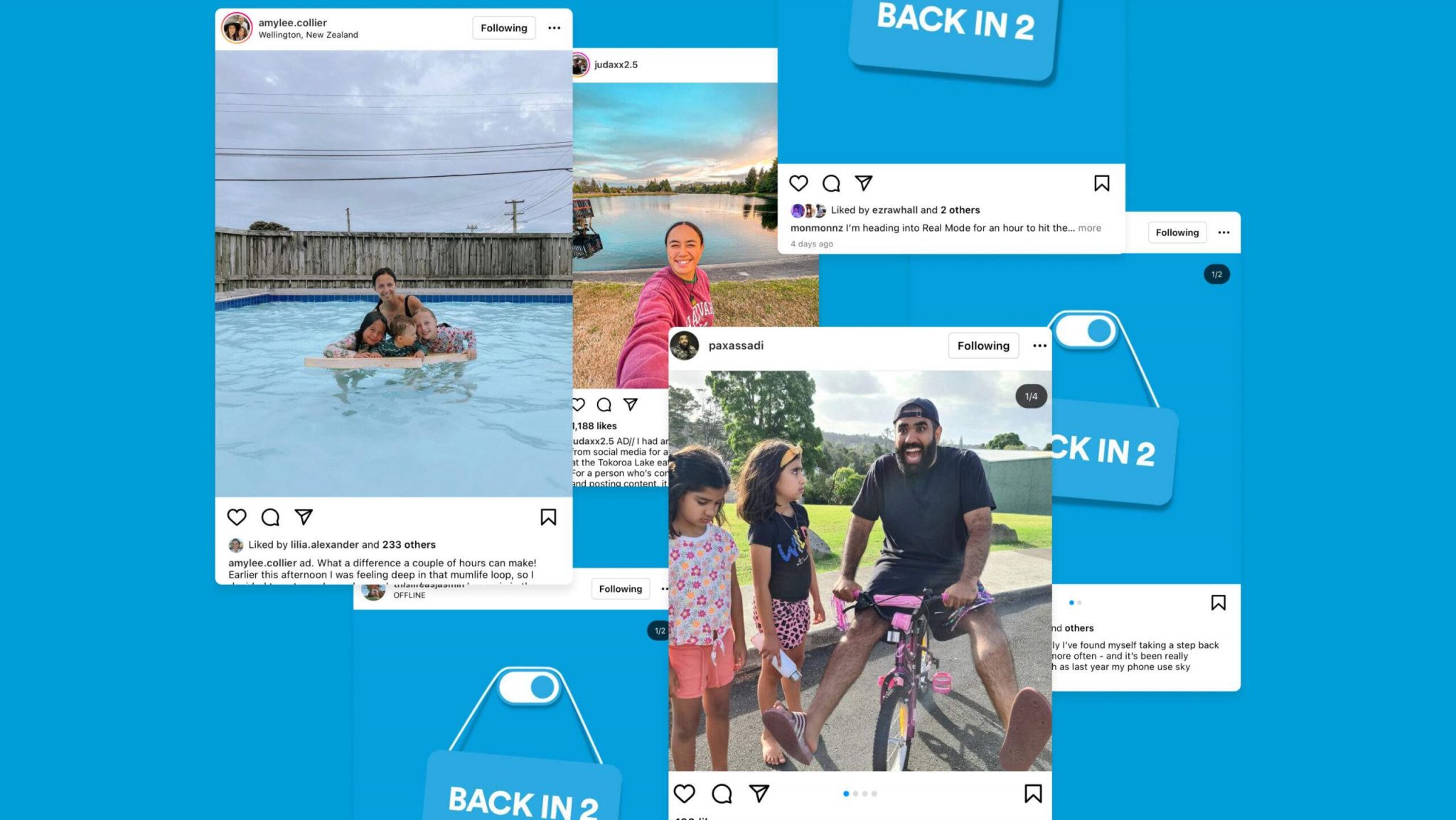
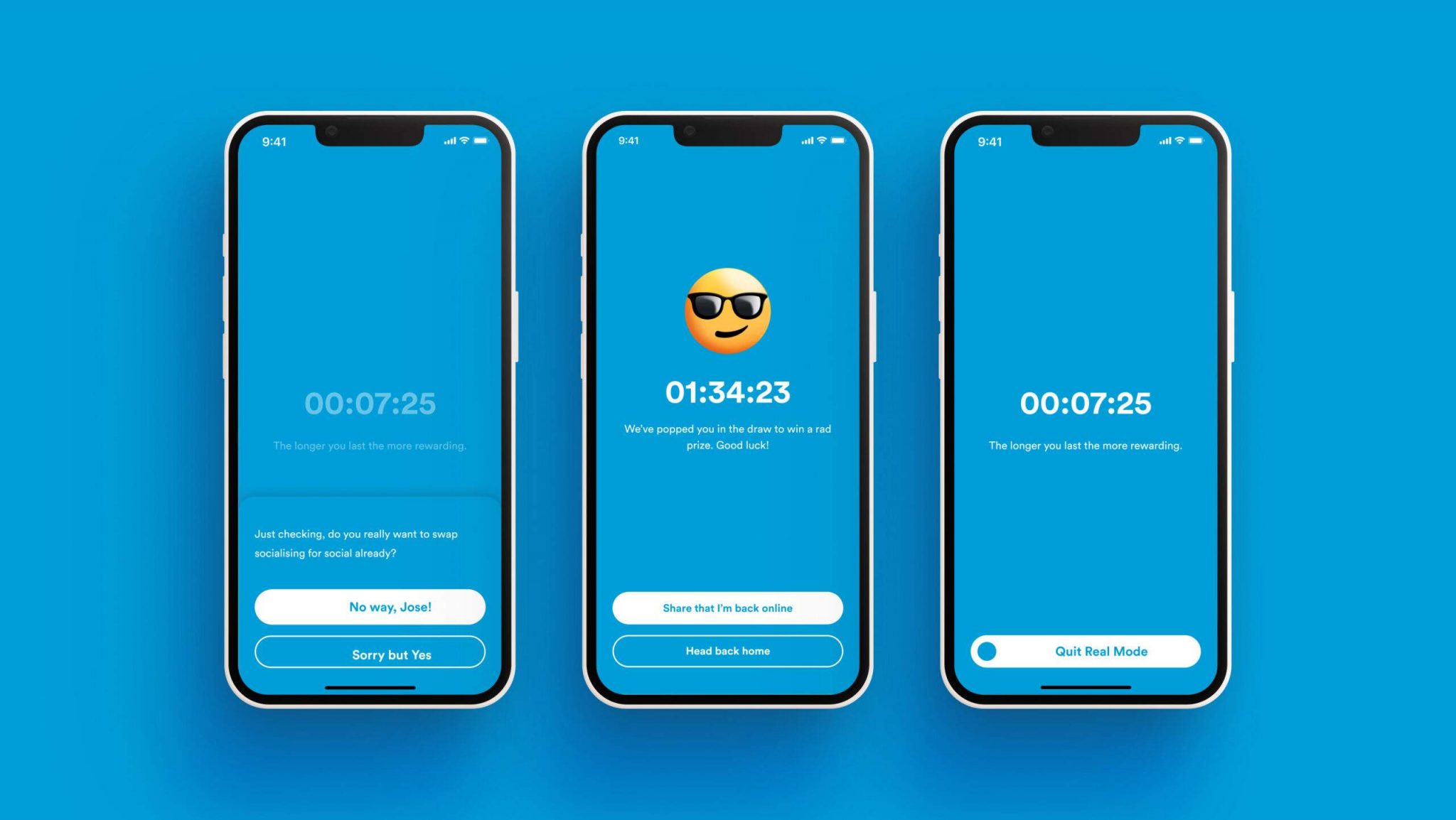
2degrees Real Mode

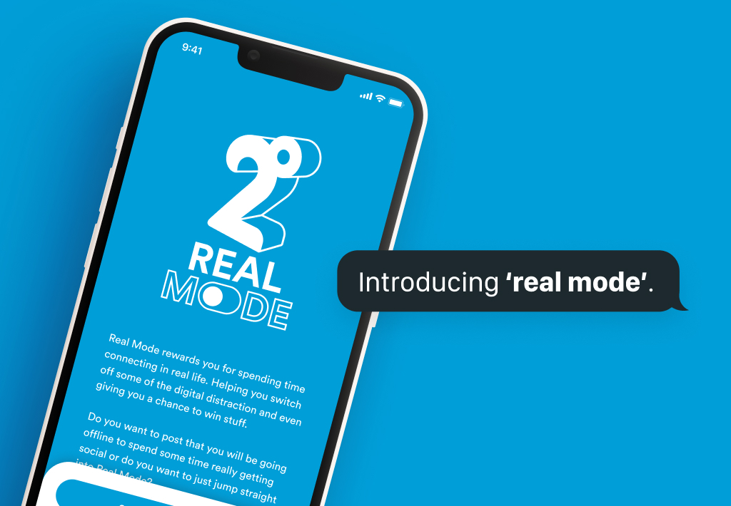
To help encourage more balanced phone use, 2degrees has launched an initiative that rewards New Zealanders for putting their phones down for a bit, and spending more time with each other – for realsies. 
 
So let’s live life unfiltered and switch our phones off for a bit. Download the Real Mode app at www.realmode.co.nz


Discussion in the media

Little Black Book:

How 2degrees Encouraged People to Switch to Real Mode

News hub:

2degrees launches ‘Real Mode’ app to help Kiwis balance online and offline lives

Stop Press:

2degrees and TBWA\NZ ask people to switch off their phones (for a bit)

IT Brief:

2degrees helps working Kiwis switch off with new app

The work:

https://thework.awardsplatform.com/gallery/JkpobOKY/yDEgraBO?search=7b94831cf5a7aebd-3


Latest projects

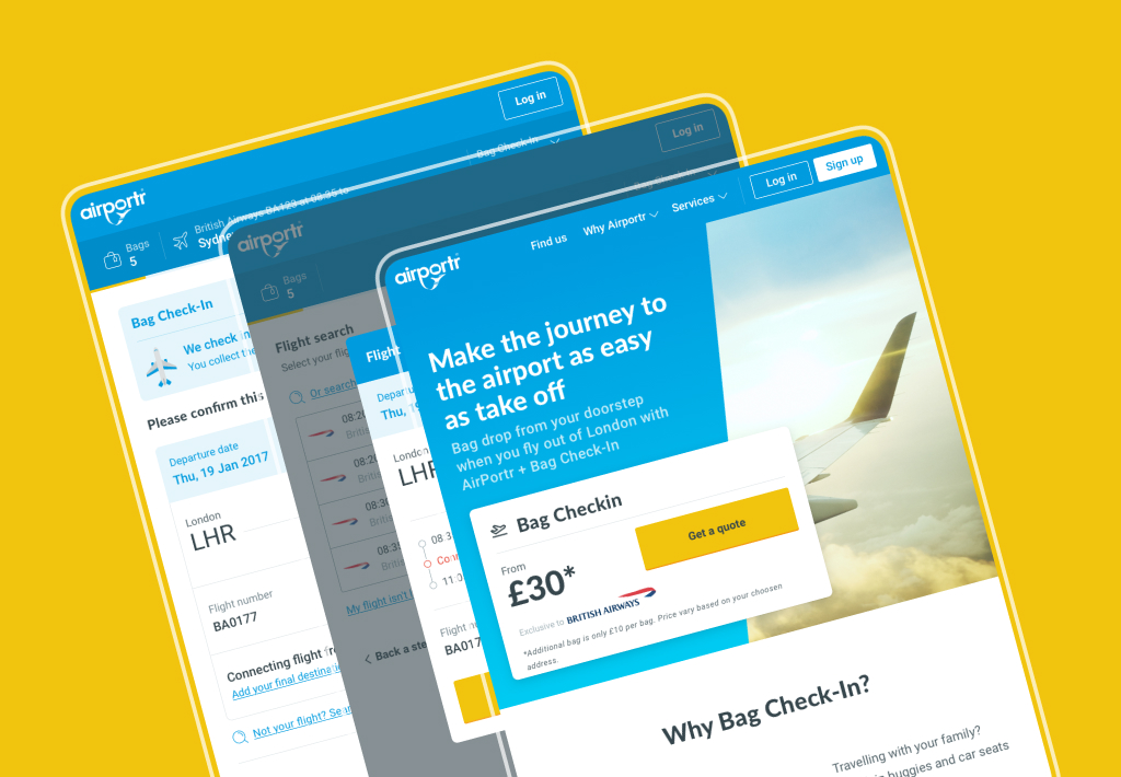
Reimagining AirPortr

In 2016 I was brought into AirPortr, a company that would deliver your luggage to and from London Airports.

Straight away the main goal was to create a new visual identity in preparation for the launch of a new booking service in partnership with British Airways launching in early October. This would enable the users luggage to be placed straight onto the plane. Magic!

First off a new design system and art direction had to be established to enable a quick launch. Along with this I took a lead role in the UX of the new booking flow on the website. Having a new product added a new layer of complexity to the system. As such constant reviews were essential both on a visual side to ensure constancy throughout the site and a UX side with rapid user testing to ensure ease and simplicity.

The visual identity of the website and other digital touch points continued to be expanded by myself with feedback coming from the heads of product, development, customer service and marketing.

Once the sketches and initial user flow was completed and approved by the stake holders the first passes of the UI were created. During the process flat, click-through prototypes were built in InVision and sent to testers via usertesting.com. These were then reviewed and any feedback rolled into the designs and sent back to the testers for further review.


Adding a personality

Although the user experience was received positively in the initial rounds of user testing, the visual style was not. To combat this a series of illustrations, each based on each section of booking were created.Once the sketches and initial user flow was completed and approved by the stake holders the first passes of the UI were created. During the process flat, click-through prototypes were built in InVision and sent to testers via usertesting.com. These were then reviewed and any feedback rolled into the designs and sent back to the testers for further review.

Portr GLUE

The design system created for AirPortr was called GLUE (Global Language for User Experiences). It was for use on the public website, booking flow, any social media pieces and the internal app that the drivers and warehouse workers would use.

It was built using Sketch’s library function and a PDF handbook created with the symbols. It was then shared using Google Drive to any other designers and developers that needed access. Below is a cross-section of the handbook and not the full guidelines.


Latest projects

Department for Work & Pensions

The DWP needed an omni-channel experience that enabled them to make their jobs easier. The application enabled users to perform feedback, read the latest news, learn new skills and search across the entirety of DWP for contacts.

A new character was created called ‘Digi’ which was built as a friendly face and digital assistant to help the user. The user could ask Digi anything they wanted via a chat interface.


Latest projects

Listen to your gut

The main target audience would be people aged 25-45 who wish approach their mental well-being in a holistic way. We are not trying to cure with food people with severe depression but help people overcome mild mental wellbeing problems.

  • Tracks & monitors mood vs food
  • Educates with tailored content
  • Inspires and motivates to have a healthier life-style
Trending page. Lets the user learn where they might need a little more help
Edit my meal screen

Simplified food and nutrition tracking

By using smart AI tech we can recognise foods and auto populate the users food diary before allowing them to tweak it. We also use basic groups to make the experience simpler and quicker.

After all, no wants to feel like a robot and count calories.


Latest projects

Boots pharmacy app

The current boots app was looking out of date and required an update. The UI was based on GEL, the Global Experience Language that was developed in trials. These trials included a Digital rewards card and Order & Collect, a new way of collecting parcels to make it easier for store colleagues and customers.