Countdown Delivery Saver

The first round of testing for Delivery Saver involved interviews with staff and real customers. During this phase, the project team spoke to customers who had used the delivery service in the past and asked them questions about their experience. They also spoke to staff members who were responsible for delivering groceries to customers and managing the delivery process.

Through these interviews, the project team was able to identify some common pain points that customers and staff experienced. For instance, customers mentioned that they often found delivery fees to be expensive and inconvenient, and that they would be willing to pay a subscription fee for free delivery. On the other hand, staff members mentioned that they sometimes faced challenges in managing delivery routes and schedules, and that the delivery process could be streamlined.

The project team used this feedback to make several changes to the Delivery Saver service. They decided to offer customers the option to pay for delivery on a per-order basis rather than requiring a subscription fee, which addressed the concerns of customers who preferred to shop in-store. They also worked on improving the delivery process by hiring additional staff and improving delivery scheduling.

The second round of user testing involved in-person interviews with a larger group of customers. During this phase, the project team presented customers with a prototype of the Delivery Saver service and asked for feedback. The team observed how customers interacted with the service and asked follow-up questions to understand any issues or concerns.

Overall, the Delivery Saver project was successful in providing customers with a convenient and affordable delivery option. By using a combination of interviews with staff and real customers, the project team was able to identify key pain points and make necessary changes to the service to address them. The team’s willingness to listen to feedback and make adjustments ensured that the service met the needs of its users and was ultimately successful.


The results

Customer sign up in first week
Average weekly basket size increased by
Percentage of customers who continued subscription

Latest projects

Reimagining AirPortr

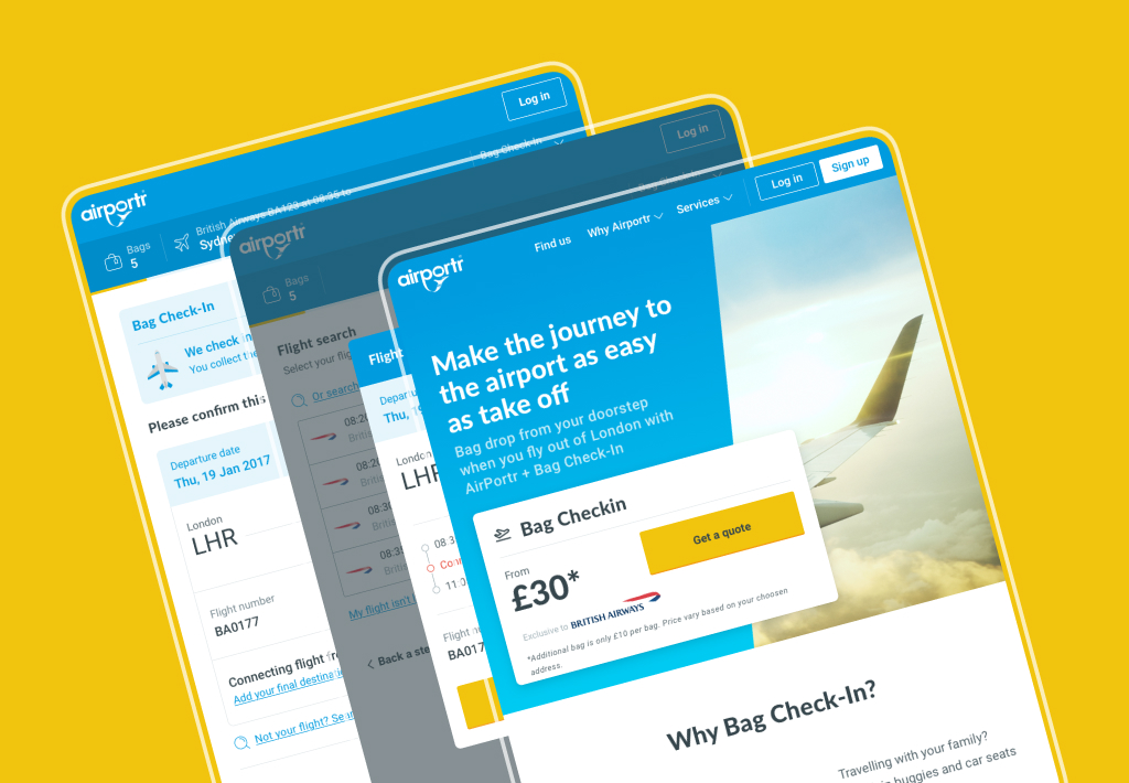
In 2016 I was brought into AirPortr, a company that would deliver your luggage to and from London Airports.

Straight away the main goal was to create a new visual identity in preparation for the launch of a new booking service in partnership with British Airways launching in early October. This would enable the users luggage to be placed straight onto the plane. Magic!

First off a new design system and art direction had to be established to enable a quick launch. Along with this I took a lead role in the UX of the new booking flow on the website. Having a new product added a new layer of complexity to the system. As such constant reviews were essential both on a visual side to ensure constancy throughout the site and a UX side with rapid user testing to ensure ease and simplicity.

The visual identity of the website and other digital touch points continued to be expanded by myself with feedback coming from the heads of product, development, customer service and marketing.

Once the sketches and initial user flow was completed and approved by the stake holders the first passes of the UI were created. During the process flat, click-through prototypes were built in InVision and sent to testers via usertesting.com. These were then reviewed and any feedback rolled into the designs and sent back to the testers for further review.


Adding a personality

Although the user experience was received positively in the initial rounds of user testing, the visual style was not. To combat this a series of illustrations, each based on each section of booking were created.Once the sketches and initial user flow was completed and approved by the stake holders the first passes of the UI were created. During the process flat, click-through prototypes were built in InVision and sent to testers via usertesting.com. These were then reviewed and any feedback rolled into the designs and sent back to the testers for further review.

Portr GLUE

The design system created for AirPortr was called GLUE (Global Language for User Experiences). It was for use on the public website, booking flow, any social media pieces and the internal app that the drivers and warehouse workers would use.

It was built using Sketch’s library function and a PDF handbook created with the symbols. It was then shared using Google Drive to any other designers and developers that needed access. Below is a cross-section of the handbook and not the full guidelines.


Latest projects